Switching your Tableau accounts

As much as I love Tableau, their website(s) can be a bit confusing at times. Surfing around on them feels that you’re required to log in multiple times during one session. This is of course due to the site actually being many sites and you can have multiple identities on them, which might make things a little confusing…

As I’m about to change employer I wanted to make sure that my Tableau identity follows me along. Not that I have that much content on the Tableau site(s), but still. So I set about changing the emails.

The one’s I’m interested in “keeping” are the account on Tableau Community and the one on Tableau Public.

First, the Tableau Public account: Login to Tableu Public (note that you might have a separate password for this one, as they are NOT the same accounts!) and make the changes in the settings section. Again, you’ll need to verify the email via a confirmation email.

Then, the Tableau Community account: Log in – no, SIGN in, on the page http://www.tableau.com and make the necessary changes in the the “Edit account” menu. Make sure to verify the email via the confirmation email sent to the updates email address. You can find the instructions here.

So far so good. Except for the fact that changing your email on the community account also affects the account you have on your customer portal :/ So currently I can access my company account logging in with my private email… And apparently, if your customer portal account is deleted, so is your community account! This behaviour/dilemma doesn’t really seem to be recognised by Tableau. I’ve been in contact with both their Tech Support and their Customer Service, but neither has yet been able to help me. Let’s hope this can be resolved, as I am sure I am not the only one who wants to keep the community identity when changing employer.

Advertisement

Be careful when copying Supermetrics files!

Even though Supermetrics is a very easy to use tool, I every now and then run into trouble using it. Admittedly, this probably should be attributed to my way of working rather than to the software itself 😉

Just last week I noticed that a couple of my reports weren’t emailing as scheduled. I couldn’t figure out what was wrong as everything looked allright, except for the emailing. So I filed a ticket and got help in just a few hours (Thank you Supermetrics for the fast response!) and got the emailing working again.

The thing was that I had the same QueryID for two different queries on different Google Sheets. As one had refreshed and emailed, the other could not do that any more as we use Supermetrics Pro and not Super Pro. Or, actually, it did refresh but it didn’t email. And having the same trigger time for both reports, according to Supermetrics’ support “… it may be random everyday which one actually sends, depending on who gets in the processing queue first.”

Luckily the fix is easy, just delete the QueryID on the sheet called SupermetricsQueries and refresh the query manually. A new QueryID is assigned to your query and you’re good to go.

Screenshot from 2018-04-15 16-17-55

So, how did I end up with the same QueryID on two reports? Easy. I had copied the entire report using the Make a copy -option in the File-menu. Which, in hindsight, obviously also copies the QueryID. But this I didn’t think about at the time. Actually, I’m quite surprised this hasn’t happened to me before.

So my advice to you is twofold: Mind your QueryID’s when copying queries and/or files. And if you have many reports to jiggle (I have approx. 200 automated reports, some of them with multiple queries) it might be worth considering to keep track of the QueryID’s.

I decided to add the QueryID:s to my masterlog of all reports I maintain. And then did add a conditional formatting rule to the area where I store the QueryID:s. This way I’ll automatically be alerted about duplicate QueryID:s across my reports.


Headache while trying to filter on a map in Tableau :/

This week’s MakeoverMonday delivered a data set on the accessibility of buildings in Singapore. For each building there is an index for the accessibility level and of course information on where this building is situated alongside with some information on that area (“subzone”). So I figured, why not plot each area on a map and then by clicking that area youl’d get a list of all the buildings in that area and their accessibility indeces? Seems straigth forward enough.

So I plotted the map, and let Tableau color the areas according to the average accessibility:

w50_singapore_averages.PNG


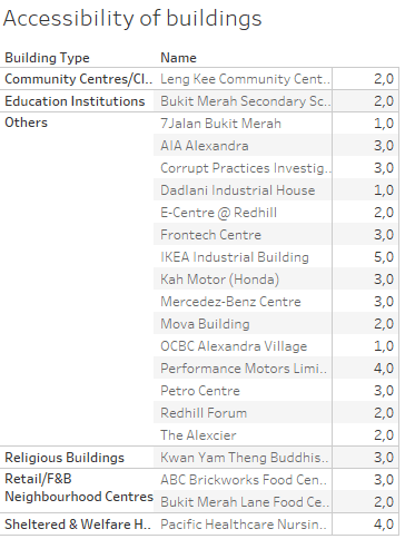
The darker the colour, the better the accessibility. Now I’d like the user to be able to click an area, for instance Alexandra Hill, and get the information about the buildings in this particular area. Like this:

w50_alexandrahill_table

But alas, this table is NOT shown when you click on the map, this action only shows one line per area, for some (for me) still unknown reason:

w50_alexandrahill_table_short

The entire list of buildings is shown only when you chose the area from a list on the side of the dashboard, but not when you click on the map. You can try it out on Tableau Public yourself.

I’ve tried different ways of filtering and different actions on the filters, but nada. I will, however, fix this! I want to understand why Tableau acts this way.  I just need to dig into it some more. So instead of serving you a nice #mmonday blog post, I shared some headache, but hey – this is not that uncommon when working with data after all 😉 Hang in there for the sequel!