Analysing the wording of the NPS question

NPS (Net Promoter Score) is a popular way to measure customer satisfaction. The NPS score is supposed to correlate with growth and as such of course appeals to management teams.

The idea is simple, you ask the customer how likely he or she is to recommend your product/service to others on a scale from 0 to 10. Then you calculate the score by subtracting the sum of zeros to sixes from the sum of nines and tens. If the score is positive it is supposed to indicate growth, if it is negative it is supposed to indicate decline.

My employer is a news company publishing newspapers and sites mainly in swedish (some finnish too). Therefore we mainly use the key question in swedish, i.e. Hur sannolikt skulle du rekommendera X till dina vänner? This wording, although an exact mach to the original (How likely is it that you would recommend X to a friend?) seems a little bit clumsy in swedish. We would prefer to use a more direct wording, i.e. Skulle du rekommentera X till dina vänner? which would translate into Would you recommend X to a friend? However, we were a bit hesitant to change the wordin without solid proof that it would not affect the answers.

So we decided to test it. We randomely asked our readers either the original key question or the modified one. The total amount of answers was 1521. Then, using R and the wilcox.test() function, I analysed the answers and could conclude that there is no difference in the results whichever way we are asking the question.

There is some criticism out there about using the NPS and I catch myself wondering every now and again if people are getting too used to the scale for it to be accurate any more. Also, here in Finland there is a small risk that people mix the scale with the scale 4-10 which is commonly used in schools and therefore apply their opinions to their years old impression about what is considered good and what is considered bad. I’d very much like to see some research about it.

Nevertheless, we are nowaday happily using the shorter version of the NPS key question. And have not found any reason why not to. Perhaps it could be altered in other languages too?


Advertisement

A new acquaintance – Google Data Studio

For the past few months we’ve been building dashboards with Google’s Data Studio. A visualiation tools that can easily be connected to a multitude of data sources. We have uploaded most of our data to Big Query to be able to easily (and with much better speed!) query the data into a multitude of dashboards.

BQ in combination with Google’s Data Studio is an easy-to-use combination to implement basic dashboards needed in a media house. Here are some examples of dashboards that we’ve built the past months:

  • A live report on the NPS for our site, including open ended comments, shown on a screen at the news desk
  • A dashboard showing which articles generate the most registrations
  • Amounts of sold subscriptions per type, date and per area
  • A vis on the demographics of the registered users (showing demo data):

Registered_demog

Data Studio is very easy to use and set up to work with different data sources. You don’t even need to do any coding to access the data in Big Query, but then again, the options on how to plot your data are limited. What you gain on the swings you lose on the roundabouts…

The plot types are quite basic, simple time series, bar charts, pie charts, tables etc. One nice feature though is the geo map that allows you to visualise your data on a map:

Subs_geo

But us non-US users still will have to wait for the zoom level to have other options than just the country for areas outside the US :/

Formatting your visualisation can, however, by no means be compared to e.g. Tableau or even Power Point. Limited options for formatting margins etc. mean that effective use of space on your dashboard is difficult. And you can forget about formatting any of the nitty gritty details on your chart.

Nevertheless, Data Studio makes it really easy to visualise your data and is a handy tool with a low learning curve. And it’s free. So why not try it out? And I’d love to hear your comments on it, so please pitch in in the comment section!


MakeoverMondays

A week ago on Thursday I attended a meeting for the Tableau User Group in Finland #fintug. There the inspiring Eva Murray (@TriMyData) from Exasol, Tableau evangelist, told us about the concept of MakeoverMonday, and had us do last week’s challenge live, then and there.

I was paired up with Jaakko Wanhalinna (@JWanhalinna) from Solutive in redoing the viz in only 43 minutes. We had a blast, and thanks Jaakko’s good knowledge of Tableau we came up with this nice remake:


mmovermonday_w45

You can find the original at my profile on Tableau Public.

Despite some schedule restraints I decided to take on the challenge of this week’s MakeoverMonday viz as well. It’s about the city transport systems in 100 cities globally. The data provided covered only the names of the cities and an index for each city. The higher the index the better. More information about the index can be found at the homepage of Arcadis, a Design and consultancy agency for natural and built assets.

Here’s my viz on the data:

mmovermonday_w46.PNG

And the original is of course on Tableau Public.

The MakeoverMonday is a fun way to experiment with Tableau and simultaneously learn about very diverse topics, I can highly recommend it! So there will be more of these, maybe not every Monday, but as often as I can squeeze them into my schedule!

Poor research is a real burden for media

With a vast experience of research my heart always cries when I come across poor research. Be it poorly designed or poorly presented – it’s such a waste of money! Sometimes I also get angry. Angry with the research institutes who sell fancy “truths” to gullible companies.  Most of the time, however, there’s not much you can do about that, other than hope the public isn’t stupid enough to believe everything they hear. For instance, when some poll tells you that a certain political party has gained in supporters at another party’s expence when in fact the margins of error make any such conclusions null and void.

But sometimes, when this poor research lands close to my own turf, I feel the need to act.

Last Friday I spent all day tearing a research concept to pieces. Comparing the results to the questionnaire and trying to make sense of it all. It’s a study that’s been done four times already and at the second and third round I was in the audience when the research institute presented the results. Both times I politely asked the researchers how they calculate certain key figures. But the answers never satisfied me. As the study was commissioned by our newspaper association and not our company, I decided to let it be, it was not my fight.

Then came the fourth round, using exactly the same concept, again with exactly the same dubious figures. So I sat down, once again, with the report and the questionnaire and pinpointed the problems with the study in a lengthy email and sent it to the persons responsible for commissioning the study. I just hope it is well received and at least leads to a thorough discussion.

Poor research should be banned. Even though we have the Esomar professional standards we are presented with way too much cr*p even from research institutes complying to the standards. The research institutes  really should go the extra mile on assuring the quality of their concepts and services because it isn’t easy to commission extensive surveys ( Esomar also has a guideline for commissioning research. Read it. And there are independent researchers out there who can help you with the commissioning. Use them.). There are so many factors to weigh in, ranging from the aim and the sample to the analysis and  conclusions. If you aren’t a research professional yourself you should be able to rely on the research institutes.

My personal favorites in the Esomar code are the following basic principle articles:

1a and 1b) “Market research shall be legal, honest, truthful and objective and be carried out in
accordance with appropriate scientific principles“. “Researchers shall not act in any way that could bring discredit on the market research profession or lead to a loss of public confidence in it.” – This is something all researchers should take to their hearts. Sadly enough many don’t. Just think about how often you stumble across crazy research and crazy conclusions. Research that does damage the reputation of market research as people either laugh at it or simply don’t believe in it.

4 c) “Researchers shall on request allow the client to arrange for checks on the quality of
data collection and data preparation.” This article implies that the quality of your work should be impeccable. You should be ready, at any time, to let the customer audit your work. Way too seldom customers ask for it though. Working at a research institute myself some years ago, I offered this option to sceptical customers – nobody has ever offered it to me.

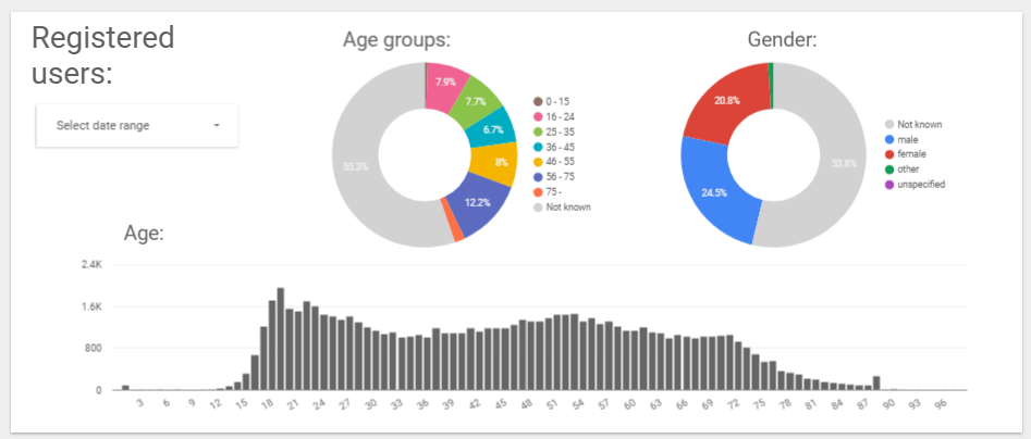
The research on media in Finland is seldom good. Too much is lost in the margins of error, too many conclusions are derived from studying means.The ambition to cover too much has resulted in monstrous surveys that serve nobody well. Thankfully, the print media audience measures has been criticised publicly by more and more people and some improvement is under way.

If we make decisions based on mediocre studies and information that cannot hold for scrutiny we won’t end up with winning products. As long a we measure a total audience and try to describe that mass of heterogeneous people as one entity we fool our selves and we fool the advertisers. We need more detailed information, we need to open our eyes to see the multidimensional audience we have. Gone are the days when one product suited all and the audience could be treated as one. Thus we should also realise that the surveys we use to measure our audiences should be re-designed to fit the needs of today. Although we might lose some trends and many grand old men and ladies will grunt in discontent, we need the change. The poor research of today is only hampering us, so let’s throw it out and bring in research that really benefits us!

Whom are we designing tablet apps for?

The tablets buyers of today are still early adopters, I’m sure we all agree on that. And at least in the US they are more often than not young affluent men. But appart from that, what do we know about the users? What do we know about our media consumers in general?

It’s easy to treat all users as one entity, as one homogeneous group of people who all use their tablets in the same way. The recent Mintel study on tablets and eReaders, tells us what tablet and eReader users do with their devices:

This is interesting reading as such but how about different user profiles? Means and averages aren’t a very good basis for development actions. We need to know more about the tablet user behaviour before starting our design process.Not all users use their tablet in the same way. This can be seen in the above diagrams. But the diagrams don’t tell us whether those who read RSS feeds also read blogs or whether those who watch movies also read news. And so on.

We need to identify the different user groups and design for each group separately, or at least keep them all in mind when designing.

Just like we know from the print media business that some read their papers from cover to cover and others only skim through the newspapers reading what they find interesting, we need to be aware that not all tablet users behave in the same way. Even though the market is still young I’m sure that there are different behavioural groups emerging. Some persons want breaking news fast whereas others like to read thoroughly about the subject at hand. Some want news about politics others about celebrities.

The technology now provides us with the tools to customise the experience. Using the same backend platform we can produce multiple experiences which can cater to the needs of different user groups. Why not do it?