Be careful when copying Supermetrics files!

Even though Supermetrics is a very easy to use tool, I every now and then run into trouble using it. Admittedly, this probably should be attributed to my way of working rather than to the software itself 😉

Just last week I noticed that a couple of my reports weren’t emailing as scheduled. I couldn’t figure out what was wrong as everything looked allright, except for the emailing. So I filed a ticket and got help in just a few hours (Thank you Supermetrics for the fast response!) and got the emailing working again.

The thing was that I had the same QueryID for two different queries on different Google Sheets. As one had refreshed and emailed, the other could not do that any more as we use Supermetrics Pro and not Super Pro. Or, actually, it did refresh but it didn’t email. And having the same trigger time for both reports, according to Supermetrics’ support “… it may be random everyday which one actually sends, depending on who gets in the processing queue first.”

Luckily the fix is easy, just delete the QueryID on the sheet called SupermetricsQueries and refresh the query manually. A new QueryID is assigned to your query and you’re good to go.

Screenshot from 2018-04-15 16-17-55

So, how did I end up with the same QueryID on two reports? Easy. I had copied the entire report using the Make a copy -option in the File-menu. Which, in hindsight, obviously also copies the QueryID. But this I didn’t think about at the time. Actually, I’m quite surprised this hasn’t happened to me before.

So my advice to you is twofold: Mind your QueryID’s when copying queries and/or files. And if you have many reports to jiggle (I have approx. 200 automated reports, some of them with multiple queries) it might be worth considering to keep track of the QueryID’s.

I decided to add the QueryID:s to my masterlog of all reports I maintain. And then did add a conditional formatting rule to the area where I store the QueryID:s. This way I’ll automatically be alerted about duplicate QueryID:s across my reports.


Advertisement

The 2018 presidential election in Finland, some observations from a news analytics perspective

The presidential elections 2018 in Finland were quite lame. The incumbent president, Sauli Niinistö, was a very strong candidate from the offset and was predicted to win in the first round, which he did. You can read more about the elections for instance on Wikipedia.

Boring election or not, from an analytics perspective there is always something interesting to learn. So I dug into the data and tried to understand how the elections had played out on our site, hbl.fi (which is the largest swedish language news site in Finland).

We published a total of 275 articles about the presidential election of 2018. 15 of these were published already in 2016, but the vast majority (123) was pubslished in January 2018.

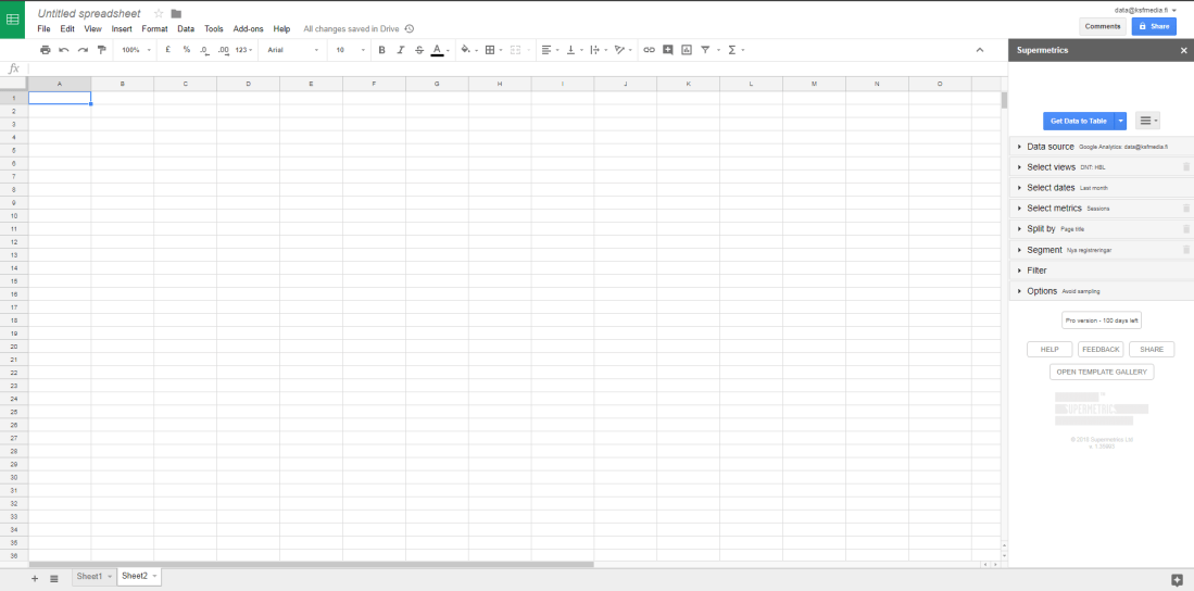
Among the readers the interest for the elections grew over time, which might not be that extraordinery (for Finnish circumstances at least). Here are the pageviews per article over time (as Google Analytics samples the data heavily i used Supermetrics to retrieve the unsampled data – filtering on a custom dimension to get only the articles about the election):

President_2018_per_day

Not much interesting going on there. So, I also took a look at the traffic coming in via social media. Twitter is big in certain circles, but not really that important a driver of traffic to our site. Facebook, on the other hand, is quite interesting.

Using Supermetrics again, and doing some manual(!) work too, I matched the Facebook post reach for a selection of our articles to the unsampled pageviews measured by Google Analytics.  From this, it is apparent that approximately one in ten persons reached on Facebook ended up reading our articles on our site. Or more, as we know that some of the social media traffic is dark.

The problem with traffic that originates from Facebook is that people tend to jump in and read one article and then jump out again. Regarding the presidential elections this was painfully clear, the average pageviews was down to 1,2 for sessions originating from Facebook. You can picture this as: Four out of five people read only the one article that was linked to Facebook and then they leave our site. One out of five person reads an additional article and then decides to leave. But nobody reads three or more articles. This is something to think about – we get a good amount of traffic on these articles from Facebook but then we are not that good at keeping the readers on board. There’s certainly room for improvement.

What about the content then? Which articles interested the readers? Well, with good metadata this is not that difficult an analysis. Looking at the articles split by the candidate they covered and the time of day the article was published:

President_2018_per_candidate

(The legend of the graph is in swedish => “Allmän artikel” means a general article, i.e. either it covered many candidates or it didn’t cover any candidates at all.)

Apart from telling us which candidates attracted the most pageviews, this also clearly shows how many articles were written about which candidate. A quite simple graph in itself, a scatter diagram coloured by the metadata, but revealing a lot of information. From this graph there are several take aways; at what time should we (not) publish, which candidates did our readers find interesting, should we have written more/less about one candidate or the other. When you plot these graphs for all different kinds of meta data, you get a quite interesting story to tell the editors!

So even a boring election can be interesting when you look at the data. In fact, with data, nothing is ever boring 😉


A note about the graphs: The first graph in this post was made with Google Sheets’ chart function. It was an easy to use, and good enough, solution to tell the story of the pageviews. Why use something more fancy? The second graph I drew in Tableau, as the visualisation options are so much better there than in other tools. I like using the optimal tool for the task, not overkilling easy stuff with importing it to Tableau, but also not settling for lesser quality when there is a solution using a more advanced tool. If I had the need to plot the same graphs over and over again, I would go with an R-script to decrease the need of manual clicking and pointing.


Switching Supermetrics reports to a new user – some tips and tricks

Recently I was faced with the need to switch a bunch of Supermetrics reports (in Google Sheets) to another user. How this is done is perhaps not the most obvious thing, but not at all hard after you figure it out.

This is how you do it:

  1. Open the report and navigate to the sheet called SupermetricsQueries. (If you can’t see this sheet you can make it visible either via the All sheets -button at the lower left hand corner of your Google Sheets or via the add-on menu Supermetrics / Manage queries). On this sheet you’ll find a page with some instructions and a table with  information about the queries in this report.
  2. Delete the content in the column QueryID :
    supermetrics_QueryID
  3. Replace the content in the column Refresh with user account with the correct credentials. E.g. if we talk about Google Analytics this is the email of the account you want to use, if it is Facebok it is a long numerical id.
    supermetrics_RefreshWithUserAccount
  4. Navigate to the Supermetrics add-on menu and choose Refresh all.
  5. Be sure to check the results in the column Last status to ensure that all queries were updates as planned.
    supermetrics_LastStatus
  6. Then, check the data in the reports themselves.
  7. When you’re done I suggest you hide the sheet SupermetricsQueries sheet so that you (or someone you shared the report with) doesn’t alter the specs by mistake.
  8. Don’t forget to transfer the ownership of the file itself if needed!


This is pretty straight forward. Updating a bunch of reports I, however, made the following notes-to-self that I’d like to share with you:

  • Make sure that the account you are using Supermetrics with has credentials to all the data you want to query!
  • Before you start transferring your reports take some time to get acquainted with the content of the reports. Perhaps even make a safety copy of it so that you can be sure that the new credentials and queries are producing the data you expected.
  • When updating the report you probably will want to make some changes to some of the queries. I noticed that when updating many queries it might be easier to update them making changes to the specifications in the table on the SupermetricsQueries sheet instead of using the add-on. Just be careful while doing this!
  • NB! If the original report was scheduled to auto refresh or auto email with certain intervals, you will need to re-do the scheduling. So make sure you know who the recipients of the original report were before you switch the ownership!

Supermetrics – Easy access to much data!

One nice and very handy tool for extracting data from various sources is an add-on to Google Sheets called Supermetrics. Using it you can access several different data sources, e.g. Google Analytics, Facebook Insights, Google AdWords, Twitter Ads, Instagram and many more. Once installed (and that’s super easy) it opens up as a side bar to your Sheet, like this:

supermetrics_sidebar

Then it’s more or less clicking the right options from the dropdown menus and you have a nice and handy report. Here’s some tips for using Google Analytics with Supermetrics:

1) Make sure that the account you are logged in to Google Sheets (and thus Supermetrics) also has access to the data you want to access.

2) Remember to have you the cell A1 selected before opening Supermetrics or your data will appear in some random corner of your spredsheet.

3) Pay attention when selecting the dates. If you plan to make a report that is auto-refreshing you need to choose the dates using the predefined intervals like today, yesterday, last week, last month, year to date etc. If you chose a custom interval, let’s say January 1st to Janyary 7th, the report will always show the result for these dates even though you ask it to refresh weekly.

4) Split by… rows and/or columns. This is the main benefit compared to querying Google Analytics directly. Here you can specify several dimensions for your data, in GA you only get two.

5) You don’t have to define any segments or filters. If you do, make sure that the account you’re logged in as also has access to these in Google Analytics (and that they are available for the view you are querying).

6) Under options make sure to tick both Add note to query results showing whether Google has used sampling and Try to avoid Google’s data sampling. You’ll see that many times Supermetrics is capable of supplying you with unsampled data where Google itself would give you sampled data.

Here’s a simple example, querying one of our sites for 2017 sessions, splitting the data by operating system and system version:

2017operatingsystems

Nothing spectacular, but very easy to use, easy to share. Absolutely one of my favourite tools!