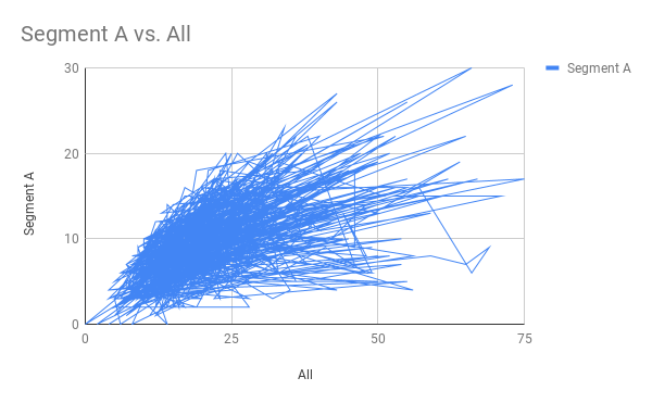
Every now and then your visualisation tool might be a little too clever. And it suggests some nice viz based on your data but the viz makes absolutely no sence. Like the one below. The credits go to Google Sheets this time. I had a simple dataset, just two columns of simple integers that I wanted to plot in a line chart. Actually, I’ve plotted seven of them already today. But come number eight, Google Sheets decides it is not an appriopriate viz anymore. So it drew this for me:
Not much information in that one 😀 Perhaps this was Googles way of telling me to take a break?
I just thought I’d share it with you since we all need a good laugh every now and then! And I just might share some other funny vizzes as they come along. Please comment and share your similar vizzes, I’m sure you have a bunch of them as well!
