Due to this text being way too long for LinkedIn, I post it here instead and try to squeeze it down to one third for LinkedIn. All those in favor of more space for yout thoughts on LinkedIn, raise your hand!
—
Yesterday was just as fantastic a day as I presumed! I attended both some awesome sessions and met interesting people in between, during the breaks.
As I ran a session myself on using R as a tool for data wrangling (thank you Jakob Styrup Brodersen for the kind words) I only had time to attend six sessions myself. All of them brilliant! And as always, it is so hard to choose… I missed out on many of the sessions I had wished so attend, like my colleague Mikko Piippo’s session on minimising analytics, Gunnar Griese’s session on how to sleep well at night whilst ensuring the data quality of GA4 and Jonas Velander’s session on improving customer journeys, just to mention a few.
The first thing I did on arrival, though, was securing my own PiwikPro hoodie! They are hot stuff in the MeasureCamp community and finally I had the opportunity to get one. And I’m currently travelling home to Helsinki via train and ferry wearing it. A bit tired, but very happy! And the hoodie is very comfy on a bit of a chilly and rainy day.
Before the sessions started Jomar Reyes and Steen Rasmussen gave the tradidional introductory speech about what an unconference is. Putting their local flavour on things of course. As the event takes place in Denmark, the main price raffled out amongst the attendants was of course a Lego set. But not just any Lego set. It was the recently released set for Sauron’s tower! The happy recipient at the end of the day was Chris Beardsly. The rest of us were left envious, with no giant Lego set to try to get home somehow. The Lego set would have been just perfect for us at Hopkins since we like to complete jigsaw puzzles together, and this would have been such a nice thing to bring home to our office to complete as the next puzzle. But we are, of course, happy on the behalf of Chris.
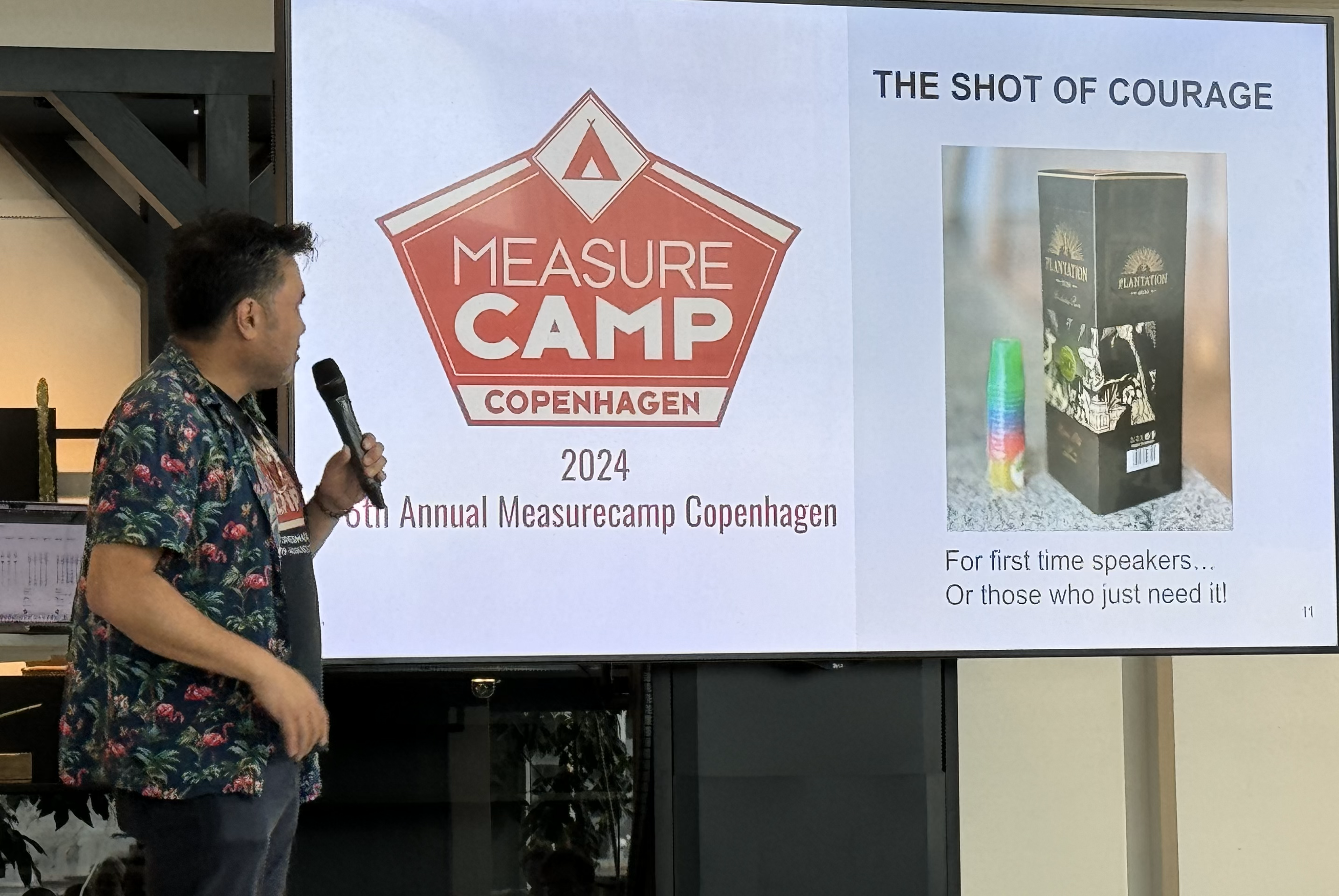
Another local flavour (pun not intended) was the Shot of Courage. For those with stage fright, or otherwise in need, there was a bottle of rum available. And some small shot glasses. Only in Denmark…
So, then to the sessions. In chronological order:
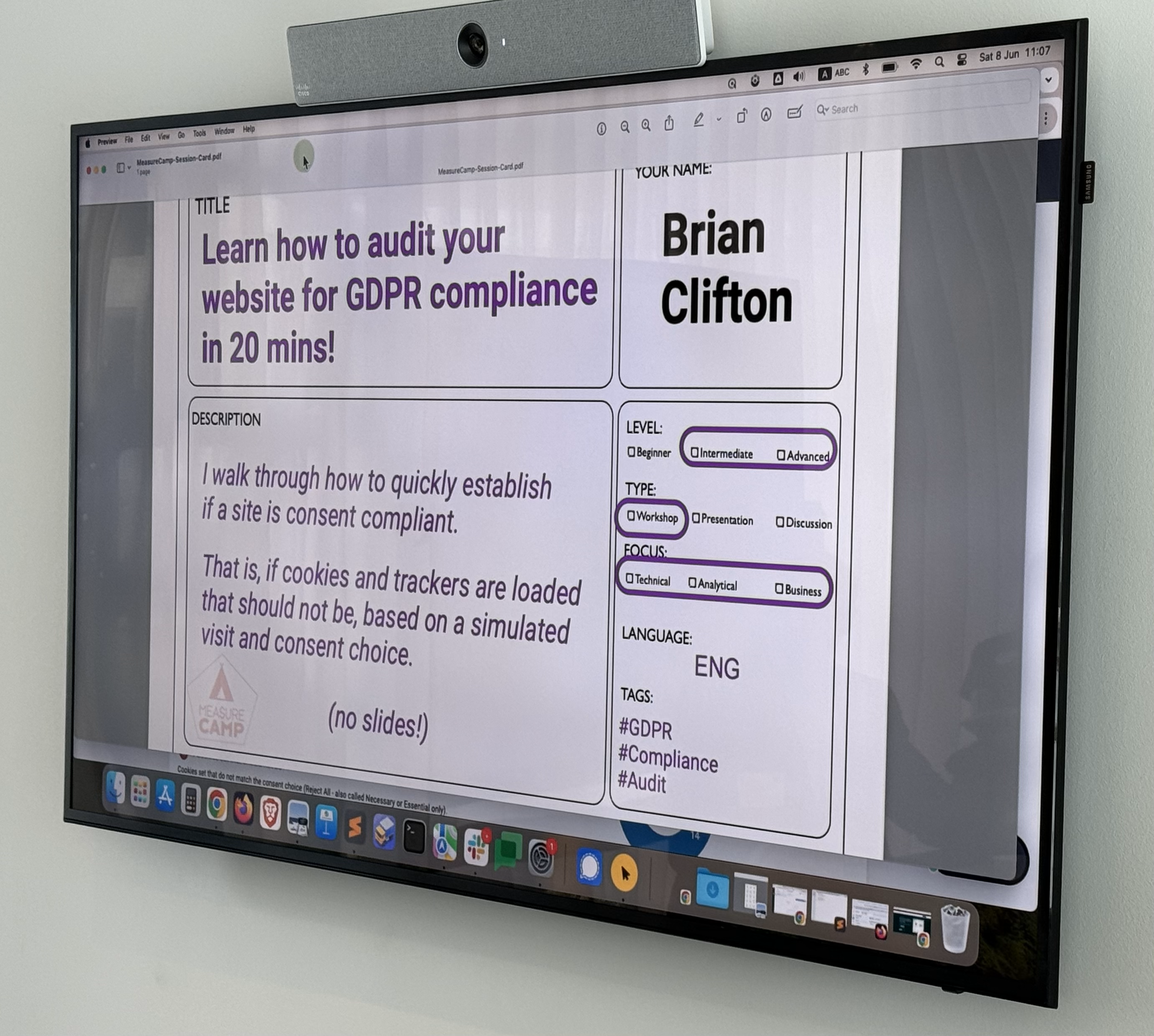
First out was BrianClifton talking about the importance of keeping track on what you’re tracking. Pointing out that you need to be mindful of all tracking that is happening, not only the cookies that everyone is talking about. For the people less into web technology it is important to understand that all the tracking done by a website is visible to the knowledgeable customer. Therefore it is very important to stay on top of your own websites (and apps!) and make sure that you track only the things the customer has given consent for. There are tools for this, one of them being Verified Data that we also use at Hopkins.
Second up was Johan Strand presenting they way they work at Ctrl Digital with utilising Google Analytics 4 data in BigQuery and LookerStudio. Johan showed us how they have started using DataForm as tools for ironing out the wrinkles of the out-of-the-box data model GA4 in BQ. A big shout out to Johan for sharing his observations and solutions with the community! Let’s all follow Johan’s example and help each other out, together lifting the craft of analytics to higher levels!

The last session before lunch was Marc Southwell from PiwikPro and Cookie Information who presented his insights from a set of over a thousand cookie consent forms from Norcic companies. The main take away being that you can (and should) optimise also your cookie consent rate. There are things you can do with your banner to lift the proportion of customers who accept the cookies. With the help of industry and country benchmarks you can go a long way to improve the rate. Every percent you win back is a significant amount of potential customers for the upper end of your funnel. Potential customers that you can serve better since they let you track them. So let’s get optimising! I certainly know how to put this into action with our customers! So thank you Marc!
Lunch was nice! We had an extraodinary discussion about all things health (some of it analytics related as well) with Astrid Illum, Danny Mawani Holmgaard, Malthe Karlsson and Katrine Naustdal. Working out is a very good counter activity to all the sitting one does as an analyst! And as an analyst – what do you do? Track it of course! Or go all the way as Astrid does, and programme an app that is tailored only for you! Cool!
After lunch I joined the session ran by Piotr Gruszecki from Altamedia about the tech stack for data wrangling and analysis at scale. Piotr gave a very inspiring talk not only about the tech stack but also on the importance of organising your work in an optimised way. The actual tech being subordinate to both the data pipeline and the work flow. Piotr’s message to us all in the community is to start working with raw data, pulling it from the systems and leveraging it for better analyses. “Think big – Start small – Scale Fast”. I think we, who have some more mileage already, can really contribute by encourigaing less experienced to try out things that might seem scary or difficult. Piotr did this in a very nice way – listen to him when you have the opportunity!

Next up was the very interesting and food for thought session by Martin Madsen from UNHCR. Martin told us about the challenges his organisation faces with the transition from Universal Analytics to Google Analytics 4. Having a large, global organisation (900 GA users!) relying on, and being perfectly happy with, the user interface of Universal Analytics that suddenly is forced to abandon it for GA4 is a giant challenge! I just love the approach Martin has taken: Boldly NOT done what all of us others have done, i.e. started building dashboards in Looker Studio or PowerBI, but rather make use of the internal reporting tools GA4 has to offer. He interviewed the end users, found out what they needed and found the solution that suits them best and never minded it is quite different from what “everybody else” is doing. This was such a refreshing example of how one sometimes can find a perfectly good and easier solution when daring to do something different. And most importantly; being extremly customer centric and really taking their need into account. Thank you Martin for sharing! And thank you for helping the UNHCR people do their extremely important work!

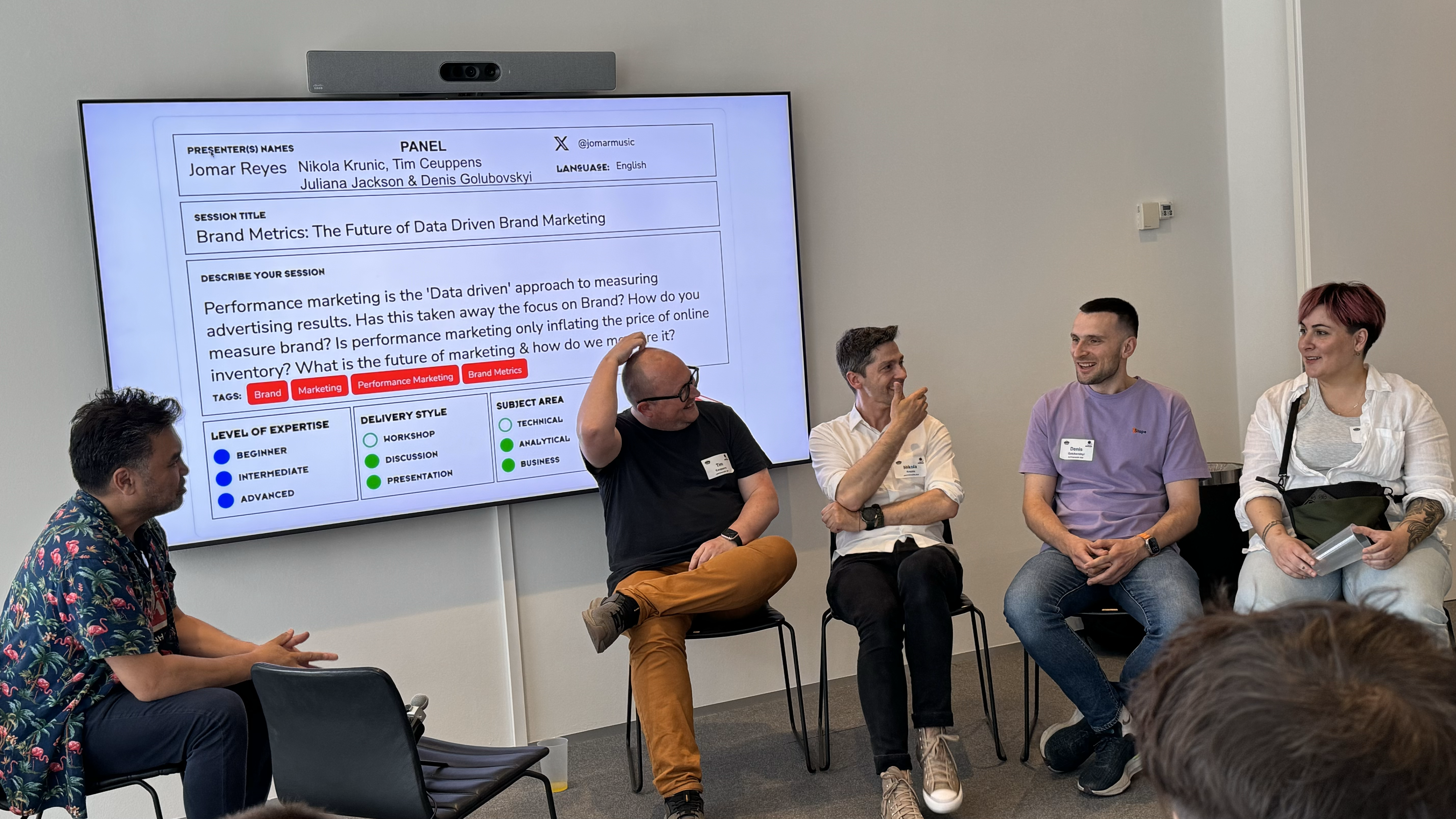
After the coffee break – when the beers were brought out, we’re in Denmark… – next up was a session doubling as a pop-up recording of an episode for the Inside brand leadership podcast. Hosted by Jomar Reyes with Tim Ceuppens, Nikola Krunic, Denis Golubovskyi and Juliana Jackson as guests. The panel discussed brand marketing in the context of digital analytics. Some very good insight were presented, so I highly encourage you to listen to the podcast when it airs! The bottom line of the discussion being, as Juliana so cleverly put it – not all marketing is advertising. And the brand marketing efforts are very hard to track, so don’t try to find them in your Google Analytics data. They are not quantitative by nature, the are qualitative. I so do agree with this. A little over a week ago, when I had the opportunity to talk to a distinguished group of marketing directors in Finland, I proposed the same conclusion. Some things are not trackable with digital analytics. For some insights you need to turn to more traditional methods such as surveys or interviews.
I ended the day with my own session on how to utilise R for data wrangling. I have done this same session last autumn in Stockholm, this spring in Helsinki and now again in Copenhagen. I have absolutely now other reason to do this but the pure joy of sharing something I am very happy with. I firmly believe that one should try to find the right tool for the right occasion and have myself harnessed R mainly for data wrangling and simpler analyses. I’ve also done some heavy lifting with it, but I seldom nowadays have the opportunity to do that. As soon as some customer needs some deeper analyses of their data though, I’ll be happy to dive in again! My session was attended by a group of persons, of whom I wish at least one would try out R and perhaps start using it. That would make me extremely happy! I was so glad to hear that Eelena Osti got inspired from my session in Helsinki and has started using R!
Cudos of course to the orgainising committe! Just mentioning some of you – Corie Tilly, Steen Rasmussen, Jomar Reyes, Juliana Jackson, Robert Børlum-Bach – but all of you should be proud of what you accomplished yesterday, it was great!
I wont even try to mention all of whom I chatted with during the day or the after party, as I am sure I’d miss some, so let’s just thank you all, and see you next time! And I wish you all more than welcome to MeasureCamp Helsinki in March 2025!
An extra special thank you though, to the sponsors enabling this MeasureCamp. These events are very important to our community and work both as knowledge sharing opportunities, network building events and recruitement opportunities. So thank you for supporting: Piwik PRO, Stape, Google, Sense8 Digital Technology , bmetric, Digital Power and Aller Media Denmark. Your help is so much appreciated!