This week’s MakeoverMonday delivered a data set on the accessibility of buildings in Singapore. For each building there is an index for the accessibility level and of course information on where this building is situated alongside with some information on that area (“subzone”). So I figured, why not plot each area on a map and then by clicking that area youl’d get a list of all the buildings in that area and their accessibility indeces? Seems straigth forward enough.
So I plotted the map, and let Tableau color the areas according to the average accessibility:

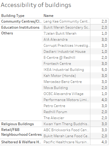
The darker the colour, the better the accessibility. Now I’d like the user to be able to click an area, for instance Alexandra Hill, and get the information about the buildings in this particular area. Like this:

But alas, this table is NOT shown when you click on the map, this action only shows one line per area, for some (for me) still unknown reason:

The entire list of buildings is shown only when you chose the area from a list on the side of the dashboard, but not when you click on the map. You can try it out on Tableau Public yourself.
I’ve tried different ways of filtering and different actions on the filters, but nada. I will, however, fix this! I want to understand why Tableau acts this way. I just need to dig into it some more. So instead of serving you a nice #mmonday blog post, I shared some headache, but hey – this is not that uncommon when working with data after all 😉 Hang in there for the sequel!