Headache while trying to filter on a map in Tableau :/

This week’s MakeoverMonday delivered a data set on the accessibility of buildings in Singapore. For each building there is an index for the accessibility level and of course information on where this building is situated alongside with some information on that area (“subzone”). So I figured, why not plot each area on a map and then by clicking that area youl’d get a list of all the buildings in that area and their accessibility indeces? Seems straigth forward enough.

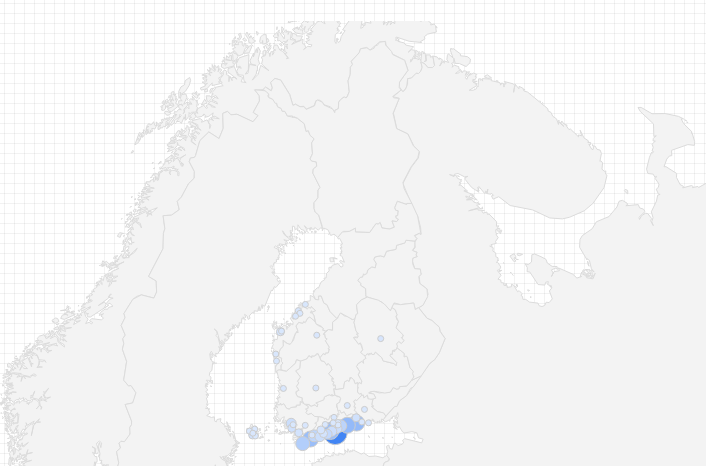
So I plotted the map, and let Tableau color the areas according to the average accessibility:

w50_singapore_averages.PNG


The darker the colour, the better the accessibility. Now I’d like the user to be able to click an area, for instance Alexandra Hill, and get the information about the buildings in this particular area. Like this:

w50_alexandrahill_table

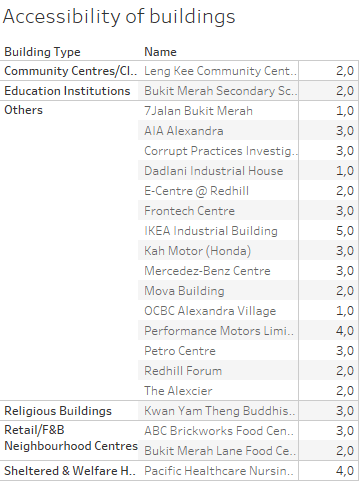
But alas, this table is NOT shown when you click on the map, this action only shows one line per area, for some (for me) still unknown reason:

w50_alexandrahill_table_short

The entire list of buildings is shown only when you chose the area from a list on the side of the dashboard, but not when you click on the map. You can try it out on Tableau Public yourself.

I’ve tried different ways of filtering and different actions on the filters, but nada. I will, however, fix this! I want to understand why Tableau acts this way.  I just need to dig into it some more. So instead of serving you a nice #mmonday blog post, I shared some headache, but hey – this is not that uncommon when working with data after all 😉 Hang in there for the sequel!


Makeover Monday – Prices of curries

This week’s Makeover Monday was about visualising a data set gathered by Financial Times. The data covers the pricing of curries at the Wetherspoon pubs in the UK and Ireland. The original story is covering several different aspects of the pricing – my simple makeover is by no means any attempt to do it better. Rather it is an excercise for myself in using Tableau dashboards.

My makeover is posted at Tableu Public. It shows a map of the pubs and when you click on a pub a stacked bar showing the pricing for that bar appears on the right.

w49_curries

A simple viz, but a nice excercise in combining maps and charts into an interactive dashboard.


A new acquaintance – Google Data Studio

For the past few months we’ve been building dashboards with Google’s Data Studio. A visualiation tools that can easily be connected to a multitude of data sources. We have uploaded most of our data to Big Query to be able to easily (and with much better speed!) query the data into a multitude of dashboards.

BQ in combination with Google’s Data Studio is an easy-to-use combination to implement basic dashboards needed in a media house. Here are some examples of dashboards that we’ve built the past months:

  • A live report on the NPS for our site, including open ended comments, shown on a screen at the news desk
  • A dashboard showing which articles generate the most registrations
  • Amounts of sold subscriptions per type, date and per area
  • A vis on the demographics of the registered users (showing demo data):

Registered_demog

Data Studio is very easy to use and set up to work with different data sources. You don’t even need to do any coding to access the data in Big Query, but then again, the options on how to plot your data are limited. What you gain on the swings you lose on the roundabouts…

The plot types are quite basic, simple time series, bar charts, pie charts, tables etc. One nice feature though is the geo map that allows you to visualise your data on a map:

Subs_geo

But us non-US users still will have to wait for the zoom level to have other options than just the country for areas outside the US :/

Formatting your visualisation can, however, by no means be compared to e.g. Tableau or even Power Point. Limited options for formatting margins etc. mean that effective use of space on your dashboard is difficult. And you can forget about formatting any of the nitty gritty details on your chart.

Nevertheless, Data Studio makes it really easy to visualise your data and is a handy tool with a low learning curve. And it’s free. So why not try it out? And I’d love to hear your comments on it, so please pitch in in the comment section!


MakeoverMondays

A week ago on Thursday I attended a meeting for the Tableau User Group in Finland #fintug. There the inspiring Eva Murray (@TriMyData) from Exasol, Tableau evangelist, told us about the concept of MakeoverMonday, and had us do last week’s challenge live, then and there.

I was paired up with Jaakko Wanhalinna (@JWanhalinna) from Solutive in redoing the viz in only 43 minutes. We had a blast, and thanks Jaakko’s good knowledge of Tableau we came up with this nice remake:


mmovermonday_w45

You can find the original at my profile on Tableau Public.

Despite some schedule restraints I decided to take on the challenge of this week’s MakeoverMonday viz as well. It’s about the city transport systems in 100 cities globally. The data provided covered only the names of the cities and an index for each city. The higher the index the better. More information about the index can be found at the homepage of Arcadis, a Design and consultancy agency for natural and built assets.

Here’s my viz on the data:

mmovermonday_w46.PNG

And the original is of course on Tableau Public.

The MakeoverMonday is a fun way to experiment with Tableau and simultaneously learn about very diverse topics, I can highly recommend it! So there will be more of these, maybe not every Monday, but as often as I can squeeze them into my schedule!